
The Match color command in Photoshop is probably one of the more misleading and seldom used functions we see. It's actually quite simple, and can go a long way to changing images. Photoshop attempts to evaluate and then match the general color and contrast of one image, and then apply it to another. Actually, it's a very powerful function and can work on photos with a lot more difference than this one. It also has a lot of potential as an "artistic" tool, because changing the settings can result in some spectacular images.
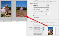
Well, it's not always perfect. In fact, it's almost NEVER perfect. Adobe and the book authors make you think it's perfect so you'll buy the product. But it's been my experience that you really have to tweak it a bit to get it working properly.
You can help along by choosing sections of the image most representative and try again...
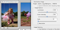
Well, the second try is not quite getting it either. We selected a good cross section of the image, but as you can see the little dress, as well as the ground area went way too much red -- while the sky STILL didn't make it to the intensity of the other shot.
We played with the settings and no matter what we tried, the color could not be matched. Why? This kind of shot is almost impossible to match. Both photographs are nearly perfect, but they're different because of the metering system in the camera. By taking a reading of the intense, close up subject, the shot was captured with a misleading richness. So, when trying to match it in the second shot, which is probably the more accurate of the two, Photoshop wants to enrich everything, where only the sky is necessary.
Yes, there must be an easier way.
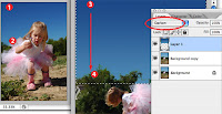
Grab the Eyedropper, (tap "i") and sample the rich sky at the very top (1), and then hit "x" to reverse the foreground and background colors -- sample again at the very bottom (2). This 'loads' the color palette.
Now make a selection in your image to cover just the area which would be the "sky" ... you'll need to include some of the trees in this scenario -- or else create a good, accurate selection of those trees to mask only the sky with a selection. I used a regular rectangle marquee because a blending mode will knock out the rest...
Now set the Gradient tool (tap "g") and make sure the gradient settings are for "Foreground to Background colors" -- which you'll find in the Gradient tool options bar. Then drag from the top to the very bottom (#3 to #4) and presto, a great sky.
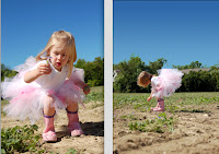
Here you see the photos are now very much matched. By setting the blending mode to "Darken" I avoided having to outline the trees. The layer was "darkening" only lighter colors -- which was the sky and not the trees. The child, dress, dirt and overall luminosity of the two are nearly identical. I did go in and lighten just a slight amount using Levels -- simply because I feared the richness of the sky would look artificial.


No comments:
Post a Comment