Black-and-white photography is as powerful today as it was when color photography was just a distant dream. A different set of skills is required when working with black and white, as the absence of color means the interplay of shape and contrast must work harder to tell the story or set the mood, but when it works, it's very effective.
Some cameras have a dedicated black-and-white mode, but even if yours doesn't, you can still work in black and white. In fact, it often works better to shoot in color and convert later on. Photoshop offers a breathtaking array of techniques for converting color to black and white (or more correctly, grayscale), and these enable you to control the process with a degree of finesse that would be difficult to match in the field.
Method 1: Desaturation
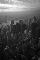
This shot was taken early one winter's morning in New York. The sky had a dramatic quality and there was a fine haze rising to meet the colder air at higher altitudes. The image works well in color, but it also has potential for a striking black-and-white impression of the city.
The most obvious way of converting color to black and white is to convert the mode to grayscale (Image > Mode > Grayscale). This is okay, but there are better alternatives.
The first is desaturation -- removing the visible color information but maintaining the RGB status of the file. This means that if you wanted to add a tint later you could do so without having to change color mode again.
Go to Image > Adjustments > Desaturate (or press Ctrl/Cmd + Shift + U).
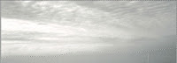
The problem with desaturation is that it often delivers a flat, uninspiring rendition. We can improve this, however. Analyzing the photo, we need to strengthen the texture in the sky by darkening the shadows and midtones, but the buildings below need a general increase in contrast to remove the haziness. It's best to treat the sky and the buildings as separate entities. Make a feathered selection of the sky, using the natural division of the rising dark haze as a guide
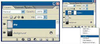
Press Ctrl/Cmd + J to copy and paste the selection to a new layer, and rename it "sky."
Add a Levels Adjustment Layer to it, making sure the two layers are combined as a clipping mask.
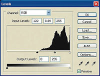
To bring out the sky texture, drag the Black and Gray point markers to the right as shown.
Here are the Before and After images, which will pop open in a new browser window.
Depending on the amount of feathering and the position of your selection, you may see a dividing line after the Levels adjustment has been made. This is easily removed by adding a layer mask to the sky layer (set to Reveal All) and painting on the mask in black until the edge disappears. Work carefully with a soft brush at a low opacity and the result
should look something like this.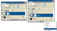
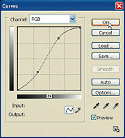
We could use a Levels adjustment layer to add contrast to the buildings, but there is an alternative route. Go to Layer > New Adjustment Layer > Curves to add a Curves adjustment layer to the background layer.
Applying the curve shown increases midtone contrast, at slight expense to the highlights and shadows. This diminishes the haziness in the area of the buildings.
The final image is far more striking, and much closer to what the photographer originally envisioned.
 As you can see, these examples were toned down, or "tinted" as we called it in the old days। The technique de-saturates color until the image is almost grayscale। Rather than desaturating using the Hue/Saturation functions, the Gradient Map has a much softer hand, and I think does a better job।