Wednesday, 26 November 2008

Setting Type Around a Circle

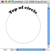
The problem with Bottom Circles... Many times it's difficult getting the type to work on the bottom of a circle। This takes a little patience and careful dexterity. Let's start with the type already set along the circle (as described previously) at the top of the circle. You should now copy that layer and then hide it. This preserves all your hard work on the top circle, which we'll be using again later.

Text at TOP of circle

Take that Direct Select tool (sometimes called "path selection tool") and
* hover at the origin point until you see the cursor with the black arrow.
* Click and drag the type down.
* Don't release the mouse until the text is where you want it.
* Go ahead। Move it around. You'll see you can get all kinds of results just in the way you drag it.


If a portion of the type goes beyond an anchor, you'll need to move that anchor. (See that dot? That's it!)
* Release the mouse and move the cursor to the END of the type.
* Drag away from the type and you'll see the rest of it appear.

Now, you have type at the bottom of a circle.

At this point you can select the type and key in the legend for the bottom of your circle. This leaves us with a layer for the type on the top, and a layer with the type on the bottom.

Fine-tuning Circular Type & the layout

Your bottom type may have become scruntched. (Slang term for "squeezed together.") So you'll need to select it with the Text Tool, and on the Character Palette, adjust the letter spacing or Tracking.

I've had to go all the way to 100 because the slab serifs in the Rockwell font are very unforgiving. With some more rounded fonts you may not have as much of a problem.
* Tip: Tracking adjusts Letter Spacing across a string of characters... not to be confused with Kerning which only affects the space between two characters!

Tracking to free the type

To finish, you can use the Direct Select tool once again to shift, stretch and adjust the circles to fit your needs. In this simple example, I've had to slightly stretch the circle to get a better visual fit with the photo. Here, I'm adjusting the left anchor of the circle -- pulling it out for a better fit.

I use the "nudge" technique... .
* Click once on an anchor point with the Direct Select pointer
* Tap Arrow keys on the keyboard "Nudge" the anchor in the direction desired
* Remember to count your taps on the arrow key. Use the same number of arrow-key-taps for the right side.

adjusting the type

Note that the path and anchors will move, leaving the type where it was. If you'll pause at the destination, the type will snap into position.

Tuesday, 18 November 2008

Membuat obyek sederhana

Membuat segi empat

1. Pilih Rectangle Marquee Tool.
2. Drag-lah sehingga membentuk segi empat.

3. Untuk mewarnai segiempat tersebut gunakan Paint Bucket Tool. Caranya klik Paint Bucket Tool, lalu klik pada area segi empat tersebut (ditandai dengan garis putus-putus).

4. Untuk membuat gambar seperti di bawah ini, caranya : seperti langkah 1 dan 2 di atas. Setelah itu klik menu Edit > Stroke. Pada text box Widt Isi dengan (misalnya) 3. Klik OK.

Membuat bujur sangkar

Untuk membuat bujur sangkar (segi empat dengan panjang sisi sama), caranya seperti membuat segi empat biasa. Hanya saja saat melakukan drag (dengan Rectangle Marquee Tool), tekan tombol Shift.

Membuat elips

Untuk membuat elips gunakan Elliptical Marquee Tool.

Membuat lingkaran

Untuk membuat lingkaran gunakan Elliptical Marquee Tool. Hanya saja saat melakukan drag, tekan tombol Shift.

Mengenal Toolbar pada PhotoShop


Thursday, 13 November 2008

Saving Bad Photos: Badly Underexposed

Quite frankly, I would much rather have a dark, under exposed photo then an overly bright over exposed photo. With a dark photo, at least there's a chance that there will be enough color data and detail to save the shot. When they're blown away and too bright -- there's little you can do to put pixels where none existed before.

Sad to report however -- so many variables come into play that sometimes the shot cannot be saved no matter what techniques you use।

under exposed photo

One reader who enjoys photographing food on trips sent this photo of the appetizer at the Kia Lodge restaurant at the foot of Kilimanjaro, Tanzania. This was a shrimp and cucumber moose, and it looks delightful. Too bad we really can't see it. Yes, I would certainly try to save that shot because you might not be going back too often!

Fixes in Layers: The next series of shots will progressively show the layers I added, and their results. After that, I'll walk through some "auto" fixes provided in Photoshop and Photoshop Elements.

Blending Mode SCREEN

My first attempt will be to SCREEN the photo over top of itself.
Drag a copy of the layer to a new layer and set the Blending mode to SCREEN। But the results are still wanting... so I'll just drag that same layer to the "New Layer" button and screen it again...

Blending Mode SCREEN


Once again, the image lightens, and we're a little closer to where the photo looks somewhat realistic. To kill much of the incandescent lighting effects -- making the shot too yellow and warm, next, I'll try a cooling filter...
Layer > New Adjustment Layer > Photo Filter > Cooling

Blending Mode SCREEN

This is going in the right direction, however it needs more। There is a slider in the cooling filter which applies more or less of the effect, but I'll leave well enough alone, and simply duplicate this Adjustment layer as well.

Blending Mode SCREEN

At this point the color seems close, but the shot is still murky and dark. Now it's time for LEVELS

Blending Mode SCREEN

LEVELS are your "all purpose" adjustments, second only to Curves as the real power adjuster. As you can see from this shot, by tightening the RIGHT slider toward the middle, and the MIDDLE slider toward the left, the photo now looks comfortable and realistic. Let's compare:

Blending Mode SCREEN

The photo is still a little warm -- evidenced by the lack of 'whiteness' in the plate, but it probably approximates what the diner saw that evening. The photo still has major problems:
It's not sharp, probably due to the low lighting and slow shutter
It's probably also suffering from some hand-held camera movement

Before throwing away a shot that really looks too bad to save, try levels and the assortment of adjustment layers available under the Layer menu. With some experimentation you can save the photo without learning hundreds of pages of Photoshop training material.

Wednesday, 12 November 2008

Cutting type into wood

The first thing we think about in such a scenario is the old-fashioned tradition of carving your girlfriend's name, or your initials into a tree. This technique is fine for the effect, however for buttons at a web site, they would be much more legible if you simply nail sign boards to the tree. Tilt and cock them to look home made, and even have a bent nail here and there to drive home the concept.

[*]FIRST: For this effect you need a chunky, poorly designed font because most of these kinds of signs are routed into wood either by hand, or using lettering patterns made for router use. I'll approve the use of the world's most stupid font -- just this once -- "Comic Sans" because it's a uniform thickness font, and it does look like an amateur wrote the letters with a router.

If you have a lot of signs to do, I recommend stepping the wood background enough times, in a file large enough to accommodate all the buttons you'll be needing. This way you only have to do the processes once.

The wood we selected has a nice dark, aged look to it, much like one might find in the Ozarks lodges.

Once we have our lettering, we'll keep that layer for safety -- but we won't actually be using that layer. Now we'll make a selection of the type, move to the wood grain layer and then pick up a copy of the wood grain into the selection and move or "float" it to its own layer. Then we'll adjust the color so it's lighter -- like freshly cut wood.

Float a copy to work on

[*] 1) Select the Type: Command (Ctrl) Click the type layer
Then turn it off by clicking its "Eye" icon
[*] 2) Select the Wood Layer by clicking it in the Layer Palette
[*] 3) "Float" a copy: Command (Ctrl) J copies to a new layer
[*] 4) Image > Adjustments > Levels (Command or Ctrl L)
now pull the right-hand slider toward the center and watch carefully as the type lightens.

Bevel

[*] Making the Cut

Now we make the cut by using the Bevel & Emboss layer style.

[*] At the bottom of the layers palette, with the floated layer selected, choose the "f" button, pull-out menu and select Bevel & Emboss
[*] Style: Inner Bevel
[*] Technique: Chisel Hard
[*] Direction: Down
Here's the way my Bevel & Emboss Settings turned out

All the other settings, depend on the size of the type and the finished art desired. For Depth, you want the edges of the cut to almost meet in the center of the letter. You'll also want to back off a bit on the opacity of the shadow areas do they're not so black, and a bit of the wood shows through.

finished

To complete the effect, make sure the sign board has some dimensionality as well. These nailed to a tree could be quite nice.

If you want to see the lettering cut into the side of a tree, let us know, or send the tree we're to use. But for the sake of web site buttons -- the roughness of the bark will cause the lettering to be difficult to read.

There are lots of other ways to do this technique. In Photoshop CS, CS2 and CS3, using the Type Mask tool directly on the wood plank would do the same in a single step.

However, this method allows us to keep editable type, and to adjust the "floated" layer color-wise until we had the effect perfect. This method works in virtually ALL image editing programs on ALL platforms which support layered art.